
LiveTiles Everywhere Panel
What used to be called the PowerPanel (from LiveTiles Intranet Enterprise) has now been moved to LiveTiles Intranet hub. It enables admins to configure a sidebar that follows the users during their whole intranet experience. The sidebar contains different sections, each containing a set of web parts/widgets. The widgets can be arranged in a layout with a certain amount of columns.
Architecture
The Everywhere Panel is deployed to a tenant as an own SharePoint Framework app that contains an application customizer for modern pages as well as a web part that can be placed on classic pages, for example to add the Everywhere Panel to the hub page. There is no dedicated backend for this app, as the configuration is stored as an own node in the LiveTiles Intranet Hub config.
Installation
To install the Everywhere Panel execute following steps:
- Download the app from here.
- Add it to your global app catalog. Please make sure that you are viewing the app catalog in the classic view, as otherwise you might not be able to deploy correctly. Make sure to choose "Make this solution available to all site collections in the organization" if you would like to globally deploy the app.
- If the app is not globally deployed, then deploy the apps on all relevant site collections
- If you would like to make it available on a hub page, please add the web part called "LiveTiles Everywhere Panel Launcher" to the hub page. Choose chrome type "None".
- Please note that wherever this app is used, the LiveTiles Intranet Hub app needs to be installed as well (either globally or per site collection).
Teams
The Everywhere Panel can be synced to Teams to be available as Teams Personal App.
For this to work, "LiveTiles Intranet Hub" and "LiveTiles Everywhere Panel" Apps need to be deployed globally to the SharePoint tenant app catalog.
After global deployment is done, you can click "Sync to Teams" in the SharePoint Files tab with the LiveTiles Everywhere Panel App selected.
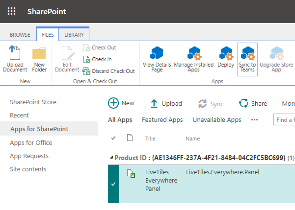
Once synced, the "Everywhere" App will be available as an App inside Teams.
Hub Widget Config
hubWidgetConfig: This is a regular LiveTiles Intranet Hub widget config. You can for example configure it on a regular page hub page and copy its JSON to the corresponding section.hubWidgetHeight: This a CSS value for the desired height of the widget.
Important Note
The LiveTiles Intranet Hub Widget configurations are not supported on the SP2019 version of the Everywhere Panel.
Changing the visibility of the Everywhere Panel
In case you would like to hide the Everywhere Panel on specific pages you can use Scoped Settings. You can provide an identifier such as the url of the page that you want to target. Check out this link in order to get familiar with this functionality:
link
Configuration
The configuration of the Everywhere Panel is done via the LiveTiles Intranet Hub JSON Editor on a root node named "panels", which will contain an array of Everywhere Panel configurations. In the "panels" node, each element consists of an object that contains two nodes: "settings" and "content".
- settings contains the basic settings
- content contains the content (sections, widgets, etc.) in the structured content format known from LiveTiles Intranet Enterprise
The widgets can be configured either using the actual config from SharePoint (this can be accessed by appending the maintenancemode=true query param to the page URL within SharePoint). Or via the configuration of LiveTiles Intranet Hub Widgets. This is the recommended approach. See the next chapter for more details on this.
Structure
The configuration for each element in the "panels" array node, should look like this:
{
"settings": {...},
"content": {...}
}
Config Sample
"panels": [
    {
      "settings": {
        "EnabledModern": "true",
        "default": true,
        "UseThemesOnModern": "true",
        "layoutStyle": "default",
        "defaultIconColor": "",
        "defaultIconBackground": "",
        "WelcomePage": {
          "heading": "LiveTiles Everywhere Panel",
          "description": "",
          "smallLogo": "",
          "bigLogo": "",
          "brandingColor": "",
          "sectionLineType": "slope",
          "previewOnDesktop": "true"
        }
      },
      "content": {
        "children": [
          {
            "children": [
              {
                "children": [
                  {
                    "id": "d144d589-e0f0-4a31-ade5-5bce1ce5d119",
                    "title": "Content",
                    "value": {
                      "hubWidgetConfig": {
                        "tabs": [
                          {
                            "configTypeKey": "widgetTab_sharePoint_items",
                            "title": {
                              "en": "Docs from SharePoint"
                            },
                            "contentType": "Document",
                            "showSearch": true
                          }
                        ],
                        "configTypeKey": "widget_tabs"
                      },
                      "hubWidgetHeight": "500px",
                      "columnIndex": 1
                    }
                  }
                ],
                "id": "5ef0adc0-191f-429b-b5bc-0ca69dffde78",
                "title": "Section",
                "value": {
                  "layout": {
                    "key": "'1column100'"
                  },
                  "noWebpartBackground": true
                }
              }
            ],
            "id": "ba26a800-dc29-4cda-bc55-4f3c4de62c85",
            "contentType": "powerpanel-panel",
            "title": "Content",
            "value": {
              "widthType": "Medium",
              "icon": {
                "icon": "ms-Icon ms-Icon--12PointStar",
                "color": "",
                "backgroundColor": ""
              },
              "label": "Content"
            }
          }
        ]
      }
    }
  ]
The value property of a SharePoint QuickLinks Web Part
"value": {
  "webpartProperties": "{\"id\":\"c70391ea-0b10-4ee9-b2b4-006d3fcad0cd\",\"instanceId\":\"d1911627-c723-496a-96b5-d78447ca8853\",\"title\":\"Quick links\",\"description\":\"Links.\",\"audiences\":[],\"serverProcessedContent\":{\"htmlStrings\":{},\"searchablePlainTexts\":{\"items[0].title\":\"Example Domain\"},\"imageSources\":{},\"links\":{\"baseUrl\":\"\",\"items[0].sourceItem.url\":\"https://example.com\"},\"componentDependencies\":{\"layoutComponentId\":\"706e33c8-af37-4e7b-9d22-6e5694d92a6f\"}},\"dataVersion\":\"2.2\",\"properties\":{\"items\":[{\"sourceItem\":{\"itemType\":2,\"fileExtension\":\"\",\"progId\":\"\"},\"thumbnailType\":3,\"id\":1,\"description\":\"\",\"altText\":\"\"}],\"isMigrated\":true,\"layoutId\":\"Button\",\"shouldShowThumbnail\":true,\"imageWidth\":100,\"buttonLayoutOptions\":{\"showDescription\":false,\"buttonTreatment\":2,\"iconPositionType\":2,\"textAlignmentVertical\":2,\"textAlignmentHorizontal\":2,\"linesOfText\":2},\"listLayoutOptions\":{\"showDescription\":false,\"showIcon\":true},\"waffleLayoutOptions\":{\"iconSize\":1,\"onlyShowThumbnail\":false},\"hideWebPartWhenEmpty\":true,\"dataProviderId\":\"QuickLinks\"}}",
  "webpartId": "c70391ea-0b10-4ee9-b2b4-006d3fcad0cd",
  "columnIndex": 1
}
The content JSON structure is a 3-level hierarchy with a hierarchical structure.
The following illustrates this concept:
{
  "children": [
    {
      // Level 1: Panel configuration
      "title": "Panel Title",
      "value": {
        // See `IPanelContentValue` below
      },
      "children": [
        {
          // Level 2: Section configuration
          "title": "Section Title",
          "value": {
            // See `ISectionContentValue` below
          },
          "children": [
            {
              // Level 3: Web part configuration
              "title": "Web Part Title",
              "value": {
                // See `IWebPartContentValue` below
              }
            },
            {
              // additional web parts...
            }
          ]
        },
        {
          // additional sections...
        }
      ]
    },
    {
      // additional panels...
    }
  ]
}
All levels of children have the following interface in common:
interface IContentElement<T> {
  id: string; // Uniquely identifies the element
  title: string;
  sortOrder: number;
  value: T;
}
This interfaces value T is individual to each level's specific configuration requirements.
Level 1: Panel configuration
interface IPanelContentValue {
  widthType: "Small" | "Medium" | "Large" | "Full screen" | "Custom";
  width: number; // width in pixels, used together with widthType: "Custom"
  label: string;
  icon: {
    icon: string; // string used in icon html class name (see https://uifabricicons.azurewebsites.net/ for all icons)
  };
}
Level 2: Section configuration
interface ISectionContentValue {
  layout:
    | "'1column100'"
    | "'2columns50x50'"
    | "'2columns33x66'"
    | "'2columns66x33'"
    | "'3columns33x33x33'";
  noWebpartBackground: boolean;
}
Level 3: Web Part configuration
interface IWebPartContentValue {
  webPartValue: ISharePointWebPartValue | IHubWebPartValue;
}

interface ISharePointWebPartValue {
  webPartProperties: string; // JSON stringified value of SharePoint Web Part Data object
  webPartId: string; // SharePoint Web Part Id
  columnIndex?: number;
}

interface IHubWebPartValue {
  hubWidgetConfig: object; // Hub widget config JSON
  hubWidgetHeight: string;
  columnIndex?: number;
}
Both SharePoint and Web Parts or Hub Widgets with their respective configuration.
Hub Widget Config
hubWidgetConfig: This is a regular LiveTiles Intranet Hub widget config. You can for example configure it on a regular hub page and copy its JSON to the corresponding section.hubWidgetHeight: This a CSS value for the desired height of the widget.
SharePoint WebPart
Enter the SharePoint maintenance mode by appending the maintenancemode=true query param to the page URL within SharePoint, where you have configured a Web Part that you would like to display in the Everywhere Panel.
webpartId: In the Summary tab, copy theIdof the Web Part and use it as valuewebpartProperties: Copy the whole content of the Data tab and stringify it as JSON string. (e.g. using the browser console JSON.stringify() command)
Layout Style Variants
The Everywhere Panel currently comes with 2 layout variants. These variants define how the Everywhere Panel is displayed within the viewport. The position is set using the layoutStyle key which excepts a value of either default, floating or overlay and is added to the settings object.
Example:
"panels": [
    {
      "settings": {
        "EnabledModern": "true",
        "default": true,
        "UseThemesOnModern": "true",
        "layoutStyle": "floating",
        "defaultPosition": "right",
        ...
Default - The default layout places the Everywhere Panel from top the bottom to the left-hand side of the viewport. This position can then be toggled from left to right by clicking the available toggle icon at the base of the Everywhere Panel. The position is saved to local storage on the end user device.
A
defaultPositionkey can be set to eitherleftorrightto define the intitial position of the Everywhere Panel prior to a user defining a position.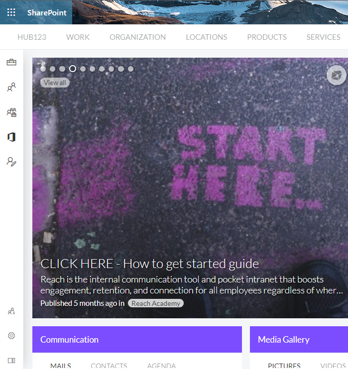
Floating - The floating layout places the Everywhere Panel as a draggable floating panel to the left of the viewport. The position can be dragged to either the left, right or bottom of the viewport by dragging the drag icon at the base of the panel. Within each position, the panel can also be dragged vertically or horizontally within the set position. The position is saved to local storage on the end user device.
A
defaultPositionkey can be set to eitherleft,rightorbottomto define the intitial position of the Everywhere Panel prior to a user defining a position.
- Overlay - The overlay layout closely resembles the default layout, but with the panel positioned over the SP app bar instead of beside it. In this layout style, the left/right position toggle is disabled.
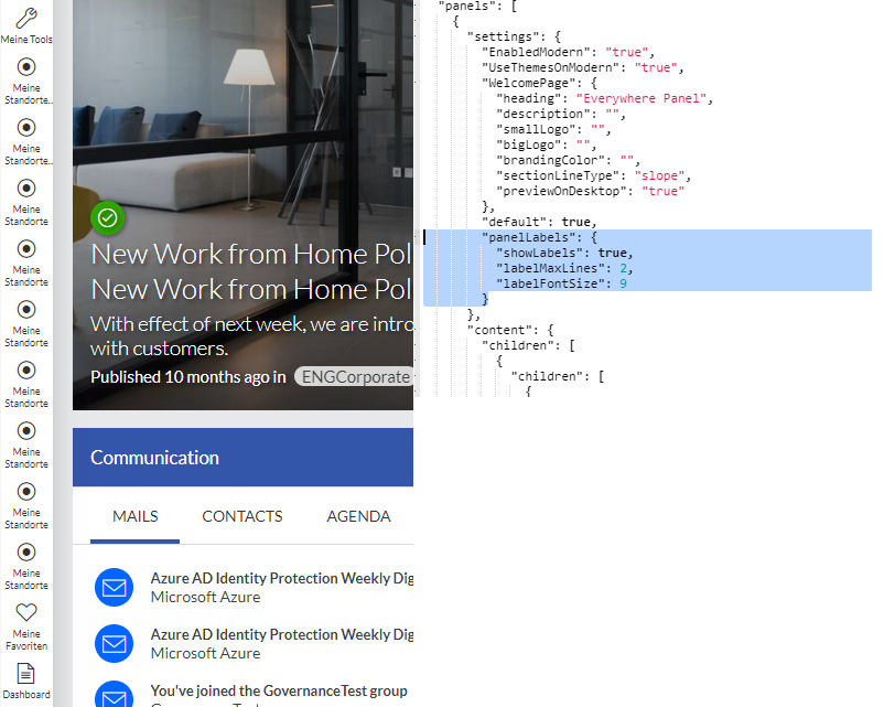
Show Labels Option
The Everywhere Panel supports labels under icons, showing the title of the each menu. The view label option is enabled by the showLabels option under panels - settings - panelLabels. Also, maximum number of lines to be shown and label font size can be set by labelMaxLines and labelFontSize variables.
Example:
"panels": [
  {
    "settings": {
      ...,
      "panelLabels": {
                "showLabels": true,
                "labelMaxLines": 2,
                "labelFontSize": 10
                }
    }
     ...
- Default - The default labels option is set to
hide labels. If enabled viapanelLabels {showLabels: true}, defaultlabelMaxLines is 1andlabelFontSize is 10if no values are provided for these 2 variables.
Updates
The code (JavaScript) for this app is served from a CDN hosted on the LiveTiles tenant. When we do a new release, we silently push those changes to the CDN. There is no need to do anything on the customers tenant unless there are major changes (e.g. in the manifest) that require the app to be updated.
Label Translations
The Everywhere Panel's element labels are now translatable. This can be achieved by editing the Everywhere Panel's configuration.
Here's an example on how to configure the translations for an Everywhere Panel element label:
 "hasMultipleParents": false,
    "sortOrder": 0,
    "id": "7e9f1f0e-63db-44da-807c-de34e8938b62",
    "contentType": "powerpanel-panel",
    "title": "Links",
    "translations": {
     "de-de": "Links DE",
     "en-us": "Links US",
     "fr-fr": "Links FR"
    },
    "value": {
     "widthType": "Small",
     "icon": {
      "icon": "ms-Icon ms-Icon--Link",
      "_icon": "https://uifabricicons.azurewebsites.net/",
      "color": "",
      "backgroundColor": ""
     },
     "label": "Links"
    }
Links on Icons
The Everywhere Panel's element icons can now redirect users to other pages. This can be achieved by editing the Everywhere Panel's configuration.
In order to use this feature, you need to add the url field inside the JSON object.
Here's an example on how to configure the icons to act as redirect elements:
 "hasMultipleParents": false,
    "sortOrder": 0,
    "id": "7e9f1f0e-63db-44da-807c-de34e8938b62",
    "contentType": "powerpanel-panel",
    "title": "Action Center",
    "url": "<-- YOUR URL --> "
    "translations": {
     "de-de": "Action Center DE",
     "en-us": "Action Center US",
     "fr-fr": "Action Center FR"
    },
    "value": {
     "widthType": "Small",
     "icon": {
      "icon": "ms-Icon ms-Icon--ActionCenter",
      "_icon": "https://uifabricicons.azurewebsites.net/",
      "color": "",
      "backgroundColor": ""
     },
     "label": "Action Center"
    }