
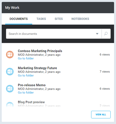
Content Items Widget
Overview
The Content Items Widget can be used to display data items from various data sources in a list or flow layout.
Configuration
The Content Items Widget is configured by using the ContentItemsWidgetConfig.
Tabs
You can specify multiple tabs where each consumes and displays the items from the associated data source.
Search Box
The items are searchable by a search term via the search box, which can be enabled for each tab individually.
Documents Extension Filtering
In the dataSource property you will need to configure a node called extensionFilter. Here is an example for it:
 "data": {
    "contentType": "Document",
    "dataSource": {
     "configTypeKey": "userDataSource_sharePointSearch",
     "rowLimit": 15,
     "extensionFilter": [
      "docx",
      "pdf"
     ],
    ...
    }
   },
Layout
The layout and item template, which specify how the items are rendered can be defined in the configuration.
Actions
You can specify buttons to execute a certain action, which will be displayed at the bottom by default.
Actions Position
Define the position of the action buttons using an actionsPosition array property. This property accepts top, bottom or both. The action buttons position will default to bottom when no actionsPosition property is set.
{
  ...

  "actionsPosition": [
   "top"
  ],
}